resource
Analyze Your Spending: How to Use the Reports Page
Looking to understand your spending and income trends at a glance? The Reports Page is your go-to hub for visualizing where your money is going — and how it's coming in. Whether you're budgeting monthly or reviewing long-term patterns, the Reports Page gives you the insight you need to stay in control.
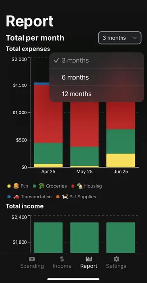
📆 Custom Time Filters
No need to crunch data manually. You can filter your reports by 3 months, 6 months, or 12 months to get just the view you need. It’s perfect for seeing recent trends or reflecting on a full year of spending.
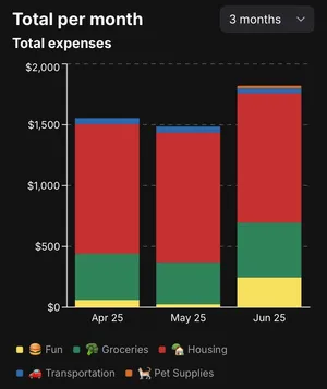
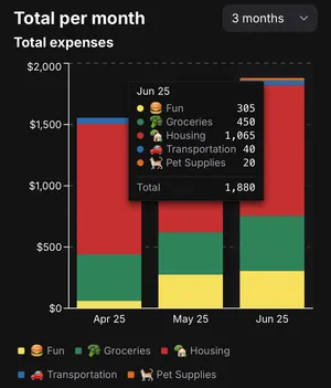
📈 Total Expenses Per Month
The first graph on the Reports Page shows your total spending per month, broken down by category. It’s an easy way to spot high-spending months or see how your expenses have changed over time.
-
Each bar represents the total for that month.
-
Categories are color-coded and clearly labeled.
-
Tap on a bar to view a breakdown of actual spending by category.
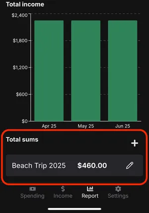
💰 Total Income Per Month
Next up: Income. The second graph gives you a clear monthly view of how much income you’ve logged.
-
Each bar shows your total income for the month.
-
Just like with expenses, tap a bar to view exact totals for that month.

➕ Total Sums: A Custom View of What Matters
Need a more personalized summary? The Total Sums feature is for you.
You can create your own total sum reports that combine specific categories and/or tags. It's great for tracking:
-
A big trip
-
Holiday gift spending
-
Renovation projects
-
Anything else you want to group and sum up separately
📖 Want to learn more? Check out our Total Sums article “Tracking Big Picture Spending with Total Sums” for a deeper dive.
Wrapping Up
The Reports Page puts powerful tools at your fingertips. With customizable filters, detailed graphs, and the Total Sums feature, you can understand your finances. Whether you're reviewing the past or simply keeping an eye on your spending, this page helps you monitor your financial habits with ease.